


Inclusive Design isn’t a trend — it’s a commitment.
Inclusive Design is about creating experiences that reflect the full range of human diversity, including ability, culture, language, age, gender, and more. It’s not just about checking off accessibility boxes. It’s about designing with flexibility, context, and care. Instead of targeting an “average” user, it focuses on the edges, because when you build for those most often excluded, you often end up improving things for everyone. It also leaves room for change, because people’s needs evolve over time.
I use methods that invite real people, their stories, cultures, and lived experiences into the design process. Some of the approaches I’ve found most valuable are art-based inquiry, multi-sensory design, and comparative analysis. I’ve also worked with co-design, community mapping, visual journaling, and storytelling-based methods, among others. Whether I’m building a toolkit or creating a brand, I focus on listening early, collaborating often, and prototyping with real-world feedback in mind.
Co-design means making things with people, not for them. It invites folks with lived experience into the design process from the start, not just as feedback at the end. That usually means sharing ideas, sketching together, and having honest conversations about what works and what doesn’t. The result is always more relevant and respectful.
Not quite. Accessibility is about compliance, Universal Design aims for a one-size-fits-all approach, and Inclusive Design adapts to people, especially those who are often excluded.
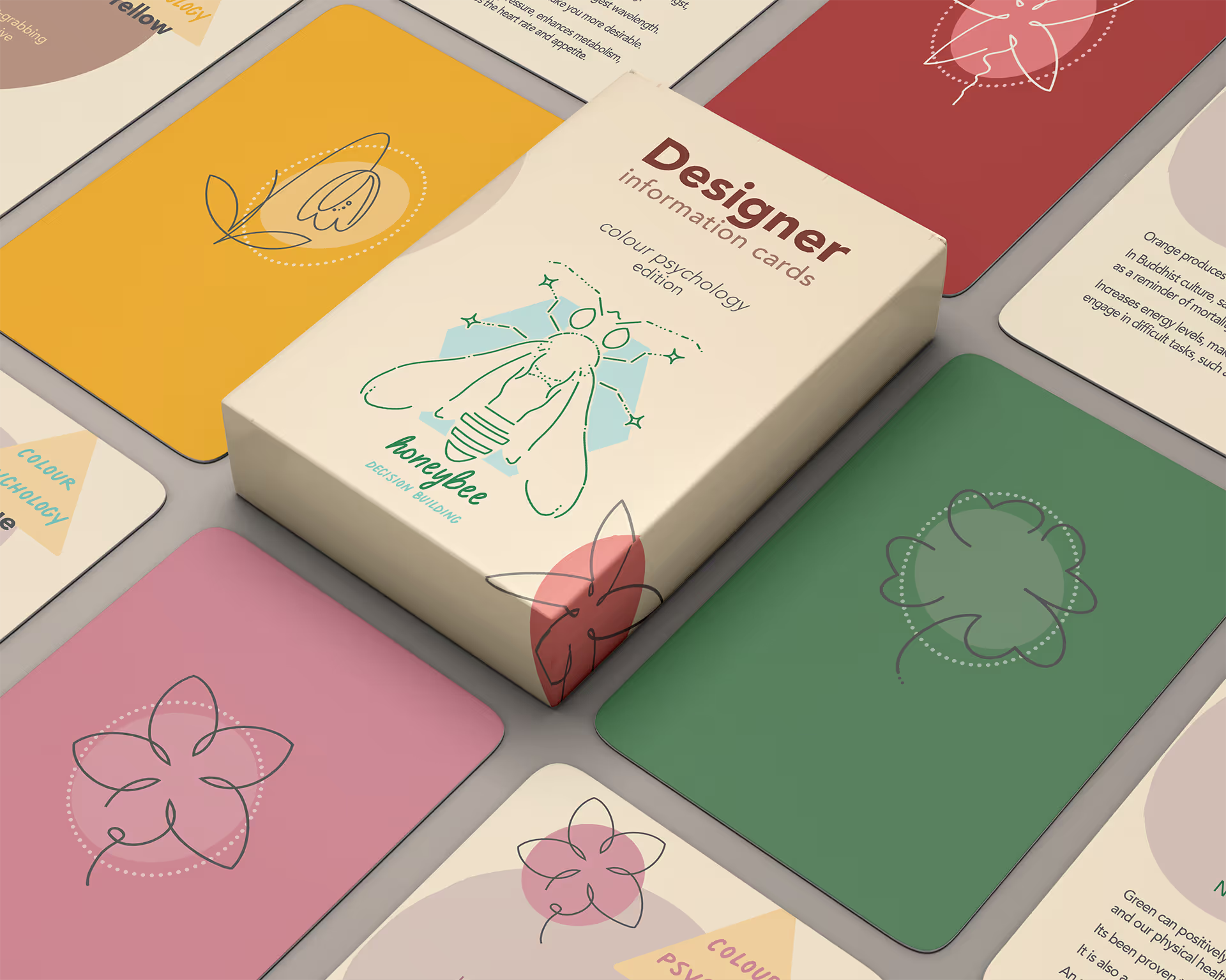
Colour affects perception, emotion, and usability. I design with colour contrast, cultural meaning, and vision differences in mind, because red doesn’t mean the same thing to everyone (or look the same, either).
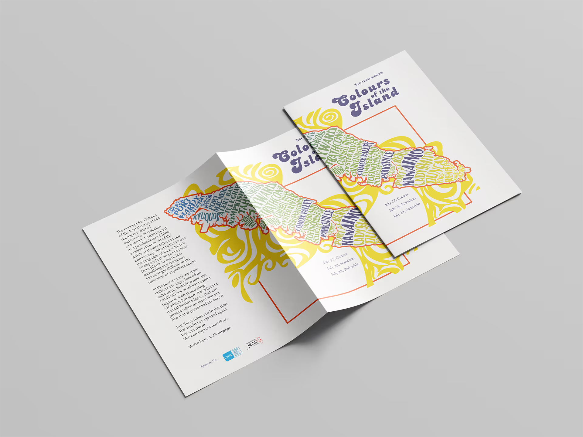
Culture shapes how we read everything, from layout and icons to colours and tone. I ensure that my design respects this, so it actually connects.
Design should be rooted in understanding. Research helps me learn what matters to people, how they interact with systems, and what they need. Whether I’m mapping cultural colour systems or studying real-world user behaviour, it keeps me grounded in relevance rather than assumptions.


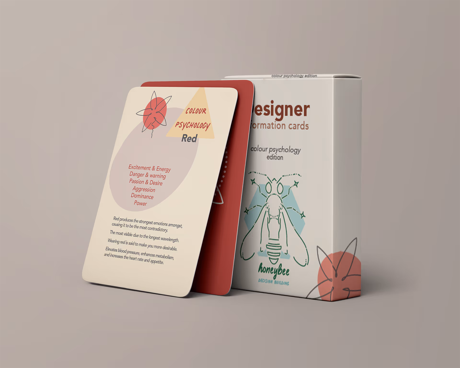


I’ve always been fascinated by how colour tells stories, how it can hold history, or mean something entirely different depending on who or where you are.